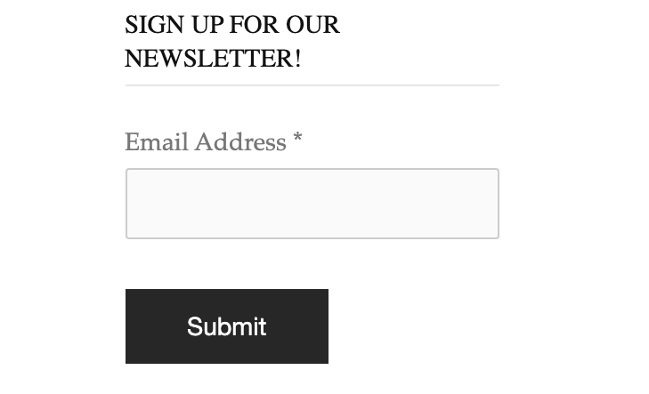
Given the growing number of digital touchpoints between you and your customers, using all your available tools is critical. The contact form is one of the most effective tools we have as marketers. A contact form is a conduit for communication between site visitors and owners. The web page allows users to contact the owner by filling out blank fields such as name, address, email, or remarks. While the contact form appears simple, it is frequently undervalued in its ability to increase lead conversions significantly.
”The average conversion rate for contact forms is 3-5%. This number can vary depending on your pricing, industry, and other factors specific to your New Orleans web design company and website, such as the number of form fields, marketing language, and so on”.
After all, an effective conversion rate optimisation strategy aims to engage leads so qualified traffic can be directed to your contact forms. Make it natural and necessary for potential customers to navigate to your contact form when they are on your site and ready to convert. In this article, we will discuss how to boost Your Contact Form.
Conversion Rates for maximum impact.
Tips for Contact Form Conversions:
Streamlining contact forms can help you increase user engagement, build trust, and increase your business conversation rate. Here are the following eight tips to improve your contact form conversion rates!
1. User-friendly Layout:
A user-friendly web form can result in faster completion rates with fewer eye movements. According to a research paper presented at the 2014 annual conference on Human Factors in Computing Systems, the size of the question field should match the size of the expected answer field.
Follow the steps below to keep your site user-friendly:
- Place the labels above the empty fields.
- Embrace a simple format and layout for the convenience of your audience.
- Use readable and clear fonts.
- Don’t split questions or have more than one question per row.
- Make it visually appealing by using a consistent colour scheme across all fields.
2. Review leads and offer multiple touchpoints:
More than a single interaction is required to convert a lead. Multiple touchpoints are needed to guide a lead down the conversion funnel effectively. After a user fills out a form, communicate with them via email, phone calls, or social media messages. Multiple opportunities for interaction can help nurture leads and gradually move them towards conversion. A full-funnel marketing strategy that tracks and moves your audience down the funnel increases the chances of customer engagement and form fill-out.
3. Use responsive design:
Contact forms, like everything else on your site, must be mobile-friendly. With mobile accounting for more than half of all Internet traffic, you can only afford to have mobile-friendly forms. The best way to accomplish this is to use a responsive web design company New Orleans, which involves creating contact forms that adjust their layout to fit the screen on which they appear. Ensure your text is legible, your fields are correctly aligned, and your buttons are big enough to tap or click on.
4. Use One Column:
Single-column forms are the quickest to fill out, the easiest to follow, and the most likely to be submitted by your visitors. Users want to complete a form in as few steps as possible. Forms with multiple columns complicate the user experience even further.
If there are horizontally adjacent fields on a form, the user must scan in a Z pattern, which slows comprehension and wastes time. If a form is in a single column, the completion path is straight to the finish line.
5. Don’t use CAPTCHA:
CAPTCHA is great for reducing spam but also reduces the number of lead form submissions. Moz studied the impact of CAPTCHA on conversion rates. Spam was decreased by 88% over a three-month test period, but there was a 7.3% failure rate. Images and text can be challenging to read, and the additional steps of solving math equations or answering questions can turn off many users. Formidable Forms uses reCAPTCHA, which is usually invisible to your website visitors.
6. Conduct A/B testing:
Not all contact forms are the same. Experiment with various form lengths, formats, and question types to see what works best for your audience. A/B testing compares two versions of your form to see which performs better. This data-driven approach allows you to make informed decisions and improve your form based on the best response from your audience. Software tools like Freshmarketer, VWO, Google Optimise, and Optimizely can aid this process.
7. Explain what happens next:
Another way to improve contact form performance is to make it clear to users what will happen next. Based on the CTA, they’ll have an idea, but they’ll fill out the form by explaining the next steps. “You can expect an email from us within 3-5 business days with a custom-made quote for you!” for example. It may also be beneficial to include language such as “That’s all you’ll get — no spam or unsolicited emails!” You could send them a confirmation email that explains it, or the form they filled out could take them to a screen that tells them what to expect. In any case, please ensure they are not caught off guard down the road.
8. Limit the number of fields:
Having too many fields in a contact form is one of the best ways to discourage people from using it. Nobody wants to waste five or ten minutes scrolling through it, and if they see 20 different boxes lined up in a row, they’ll close the tab.
For any given form, use the fewest number of fields possible. If you only need someone’s email address, save time by asking for their phone number.
Conclusion:
Are you ready to boost the conversion rates of your contact form? SoftCircles is here to help! Our over 100 testimonials show that we are the agency businesses rely on to drive results for their web design and marketing, and we can’t wait to prove it to you. Our conversion rate and web design services will help you implement the above contact form tips. Still, they will also optimize elements of your site, such as navigation and page speeds.

Get 4 Free Sample Chapters of the Key To Study Book
Get access to advanced training, and a selection of free apps to train your reading speed and visual memory


