Usually, I focus on large mental structures, like mental palaces and cities or massive mindmaps. We do not always need something massive. Quite often it is enough to place a mental wardrobe in one of the existing mental palaces.
The Memory Wardrobe, a sanctuary of nostalgia and tales untold. Each garment, a vessel of recollection, woven with threads of yesteryears. Layers of fabric holding whispered secrets and cherished moments, waiting to be revisited. Open its doors, and embark on a journey through the corridors of time, where memories unfold.
Why would one need a mental wardrobe?
Quite often we learn subjects iteratively, increasing our understanding with each iteration. In this case, we may already have a mental palace for some subject and all we may want to do is provide a deeper dive into the subject, probably on one of the walls within the palace. Unlike mindmaps that can be put on a wall as a tapestry, mental wardrobes are almost regular mental palaces. We can reuse actual wardrobes with shelves, and itineraries between shelves.
Please notice, I already have an article on this subject https://www.keytostudy.com/mental-wardrobe/. Why do I need another article? Because I want to address more perspectives and write a detailed explanation. Also, while we can make a wardrobe with dresses – such elements are better used with creativity exercises of multiple perspectives like thinking hats. Here I want to show how shelves can be surprisingly effective.
Memory wardrobe is a worthy addition to any mental palace. You can learn about mental palaces and things you can put in them in my memory masterclass. You do not have to pay the full price. Contact [email protected] and ask for a deep discount. You can practice this technique as soon as you build your first memory palace, placing wardrobes along the walls of your palace rooms.
Mental itinerary
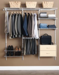
Inside a wardrobe or a closet, there are several shelves comparable to rooms in a mental palace. We can decide on an itinerary within each shelf, for example, left to right on odd shelves and right to left on the even shelves. This particular pattern eliminates “saccading” as we visualize, minimizing the required focus changes.
This point is quite strange. When we visualize we probably still move our eyes. So if we want to reduce eye motion, the entire shelf should be visible in one “go” and we should move attention rather than eyeballs to speed things up. This is not so important in regular mental palaces where we kind of fly through the rooms. Here, our visualized bodies do not move between shelves and we need to ensure that the eyeballs also move not very fast.
Four walls and four corners
While we can put anything anywhere in mental palaces, it is usually advised to place objects just along four walls and four corners. This way, the space is clean and the progress is repetitive and predictable. We kind of have a feeling regarding how much information can every room hold. Shelves are usually very prolonged, and we ideally want almost quadratic wall segments, hence we visualize mental fold lines, subdividing the area into columns.
On a shelf there are two corners (left and right), so we add division to the shelf itself (left half vs. right half, or even three columns), and we add the same division to the wall behind the shelf. Thus we generate additional virtual corners in the fold between the visualized parts of the shelf. Effectively for three columns, we get four corners or folds, three floor sections, and three wall sections. We can then place PAOs into the corners or folds, mindmaps on the walls, and whatever we want on the floor, like a mindmap or a miniature palace, a chessboard, etc. The floor here is more useful than in an actual mental palace as we do not step on it, so it is always visible. As we learn more about the subject, the floor provides space for another iteration of data.
Recognizing shelves
Notice that I did not put memory containers on the left and right sides of each shelf, as I want to use those to recognize the shelves themselves. I also suggest using the floor part of the central sections for items that identify the shelves.
Just like we use for the mental houses our own homes thoroughly decluttered, we can use for the mental wardrobes our actual closets stripped of meaningless junk. We leave barely enough content to recognize each shelf, not more so that we do not become confused or defocused.
The focus becomes more important as we speed up. At low speeds we can have as many features as we want, visualizing exactly some objects we used in childhood. As we speed up, all but the critically important features disappear. Every feature we visualize needs to be very simple, high-contrast, and very characteristic of the specific object.
How does a mental wardrobe implement a classical mental palace?
The way I describe a mental wardrobe is very common to all mental palaces. In all mental palaces, we usually start with some object we know intimately well, but then we simplify it stripping anything that does not contribute to the itinerary. In every mental palace, we will use one fixed itinerary that passes through the rooms only once, does not cross itself, etc. Most of us have very few templates of such mental palaces prepared well before we need them, and ready to be used time after time. However, since a wardrobe is not a house, some specific perspectives outline subjects we often forget in regular mental palaces.
Nested mental wardrobes
One of the coolest features of mental wardrobes is nesting. We can visualize a mental palace in the middle of a room of another mental palace, but this visualization is not natural. Visualizing wardrobe-like organizers within wardrobes is natural since we use these objects-for example for jewelry.
And we should stop nesting with jewelry boxes. In theory, we can put a toy mental palace or a miniature box within a jewelry box, creating a sort of Matryoshka doll. Practically such structures are overly complex. Mental palaces are not really built for deep nesting. We are not supposed to stop in the middle of a room and start digging. Occasionally there is no better choice, but such events are rare.
An ideal wardrobe
An ideal mental wardrobe has 3 virtual columns per shelf. It is possible to add an extra layer of stacking using 3-door wardrobes with 3 columns per shelf. Beyond 3 columns the object becomes harder to visualize and honestly, there is no use case I can mention. Typically there are two compartments: upper and lower. In the upper compartment, there are 4 shelves, in the lower compartment there are 3 shelves and one drawer. Drawers kind of hide their content, so they are less than ideal for quick mental itineraries but useful for hiding jewelry boxes. All drawers should have transparent front in visualization so that we will understand if they are empty or full.
If we have 4 doors, we can add suits or dresses in one of the doors. These suits typically represent perspectives or stakeholders for the project: marketing, engineering etc.
The same structure can apply to jewelry organizers. Some of them have hanging items, others may have a matrix of storing compartments of maybe several drawers (or layers) for an extra level of nesting.
Physical object anchoring
It is nice to have several options for wardrobes and jewelry boxes, and it is useful to have the actual objects at home. If we do not have physical objects, our visualization may mutate, slowly diverging from the original. At some point, the versions of the object may become incompatible, for example, due to modifications in the shelves we use. This is uncomfortable.
Moreover, we kind of need to review the objects from multiple angles as we navigate the mental palaces. It is simply easier to do that with physical objects.

Get 4 Free Sample Chapters of the Key To Study Book
Get access to advanced training, and a selection of free apps to train your reading speed and visual memory

