In some of my courses, I suggest using brands and logos for the visualization of complex ideas. I kind of assume that this is straightforward… What if it isn’t? Here I provide more guidelines and ideas…
Avoid abstractions
Our language is full of abstractions. When we visualize, we should really avoid abstractions, because how do you visualize THAT?
Fortunately, we have certain languages for abstract concepts, like the language of math. If we write “+” or “*” everybody knows what it means. And with very little practice logical signs like “|” and “&” can be learned. This is what I call “logical parkers”. Some come from basic algebra, some from propositional logic or statistical inference. I discuss more in my “research and creativity” masterclass.
The mathematical language is a bit limited to certain abstract concepts. What should we do with other abstractions?
Symbolism
Here we can use the language of religious art, called symbolism. Medieval images and texts are full of symbolism. There were animals specifying any sin or virtue. For example, we use a pigeon with an olive leaf for peace, or just the shape of its foot.
Now, medieval symbolism and heraldic language were significantly more complex. For example today we use cheetah as a symbol of speed and owl as a symbol of learning and wisdom.
The symbolism of the owl dates to ancient Greece, where the owl was the bird of the goddess Athene. We can use a lot of greek mythology in our symbols. Like the snakes of Asclepius for medicine, or winged boots of Hermes for trading and messaging.
Understanding mythology definitely helps with many of the abstract words. We can also use our own symbols. For example, I often use “666” for the worst possible outcome.
Numbers and letters
Usually, we encode numbers using PAO or peg system. But we can also do the opposite and encode complex ideas in numbers. For example, the symbol of infinity looks like number 8. Emptiness is easily denoted by 0. Uniqueness by 1. Duality by 2.
The numbers or letters should be further shaped into a proper font. For example “V” for victory is usually displayed in fingers, while “V” for Nike’s logo (just do it!) has a very specific font. Fonts and colors transform abstract letters into specific symbols. You should always use them.
You can easily combine 3 of such symbols into a monogram. A monogram is a logical equivalent of PAO, and it defines quite well a lot of concepts. It can also be used for specific people, binding their initials with unique fonts. Many people actually use monograms as signatures and seals.
From letters to logos
Corporate logos usually contain one symbol and one word. Of course, there are many exceptions, but let us start with the commonality. One or two of the letters in the company name are often stylized into a very specific font. Think about the “G” in google, the “M” in MacDonalds, as a perfect sign for fast food or “W” in Volkswagen as a sign for affordable car.
Notice a single letter is better than three letters and three letters are better than a whole word. Clearly, we are trained to recognize two words as “Coca Cola” and perceive them as one symbol. However, this is a complex symbol to memorize.
So brands often feature graphical symbols. Like the apple in the Apple logo. The simpler the symbol, the easier it is for visualization. Japanese car logos often have some of the best graphemes: the Mitshubishi, Toyota, and Mazda symbols are sublime.
Colors
Some symbols have no color associated with them, like the playboy bunny as a symbol of seduction. Other symbols are very colorful, like the peacock in the NBC logo or four colors in the google logo.
We should not mess up with the corporate colors in our visualization. This can become inconvenient. For example, for the social networks we can use the while “f” of facebook on the blue background with a very specific font and color.
This is not a big deal. For love, we automatically use a red heart. Olympic symbol for sports has 5 distinctly colored rings.
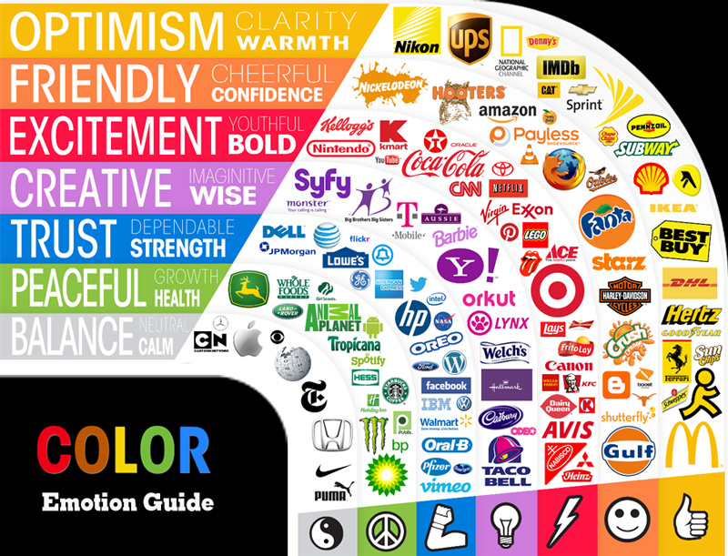
Below are some color-coded emotions with the relevant facials

Red with anger, blue with sadness, green with envy, sunny optimism… Our colors are already filled with emotional content even before they are attached to brands.
Here is an emotional guide to brand colors and an example of a non-branded symbol in each category.

Simplicity
We want our visualizations to be unique, simple and based on real objects. These requirements are contradictory. Brands are often complex to facilitate trademark and copyright protection, as well as including the full brand name in the logo. Choose wisely. Also, notice that the iconic brands are starting to drop names from symbols to facilitate international recognition and visualization.
This is very cool. The more effective logos are usually also very simple, making easier the visualization.
You have a choice, as many companies present several versions of logos with varying levels of detail and complexity.
Emoji
For our convenience describing complex content, mobile companies built a standard language of signs called Emoji. Maybe 10 years ago the concept of emoji was new and very few people went beyond ASCII :)). Today we have a very wide range of emoji to convey abstract feelings. Use them in your visualizations, like you would use in your messages to the closest friend.
Our visual language is yet another language we use, and we can use very similar ideas.
Chinese mnemonists often use hieroglyphs in their visualization. This is fast and accurate, especially since they spent a large part of their life drawing and recognizing hieroglyphs in various calligraphic scripts.
Our emoji are our hieroglyphic language, and we should use it when we can.
Size matters
Typically we use symbols either very large to symbolize an entire context, like a brand on a building, or very small details, like monograms on pockets. Very rarely the symbols will appear the same size as PAO or other visuals.
We want to use our symbols in the same way as we use them in real life. Otherwise, we add another credibility gap to our visualization – which will slow things down.
We reuse the same logos, so they drive the meaning from the things that accompany them: either as their parts or as their containers.
Do not use only symbols and logos: add some other visualizations to the mix. Our brain is not “programmed” to stop on brand names. We have seen too many ads and the focus glides along to something more substantial.
2D vs 3D
Mindmaps are basically 2D, while mental palaces are 3D. Most symbols and logos are 2D, so we need to modify them for a mental palace. We can embed them above the doors, on the pockets of our PAO, on the walls… There are many places for 2D symbols in a mental palace.
It usually makes no sense to put 3D logos as, they pull a lot of attention and do not encode enough words. So if we use those, it is to pull the attention to what follows.
Often this is very similar to real worlds signs: there are many 2D signs, but very few huge toys or cars styled as 3D ads.
Bottom line
Our symbols are a part of our culture and language. We can definitely use and reuse them. Just make sure they are mixed and matched with other visualizations.

Get 4 Free Sample Chapters of the Key To Study Book
Get access to advanced training, and a selection of free apps to train your reading speed and visual memory
